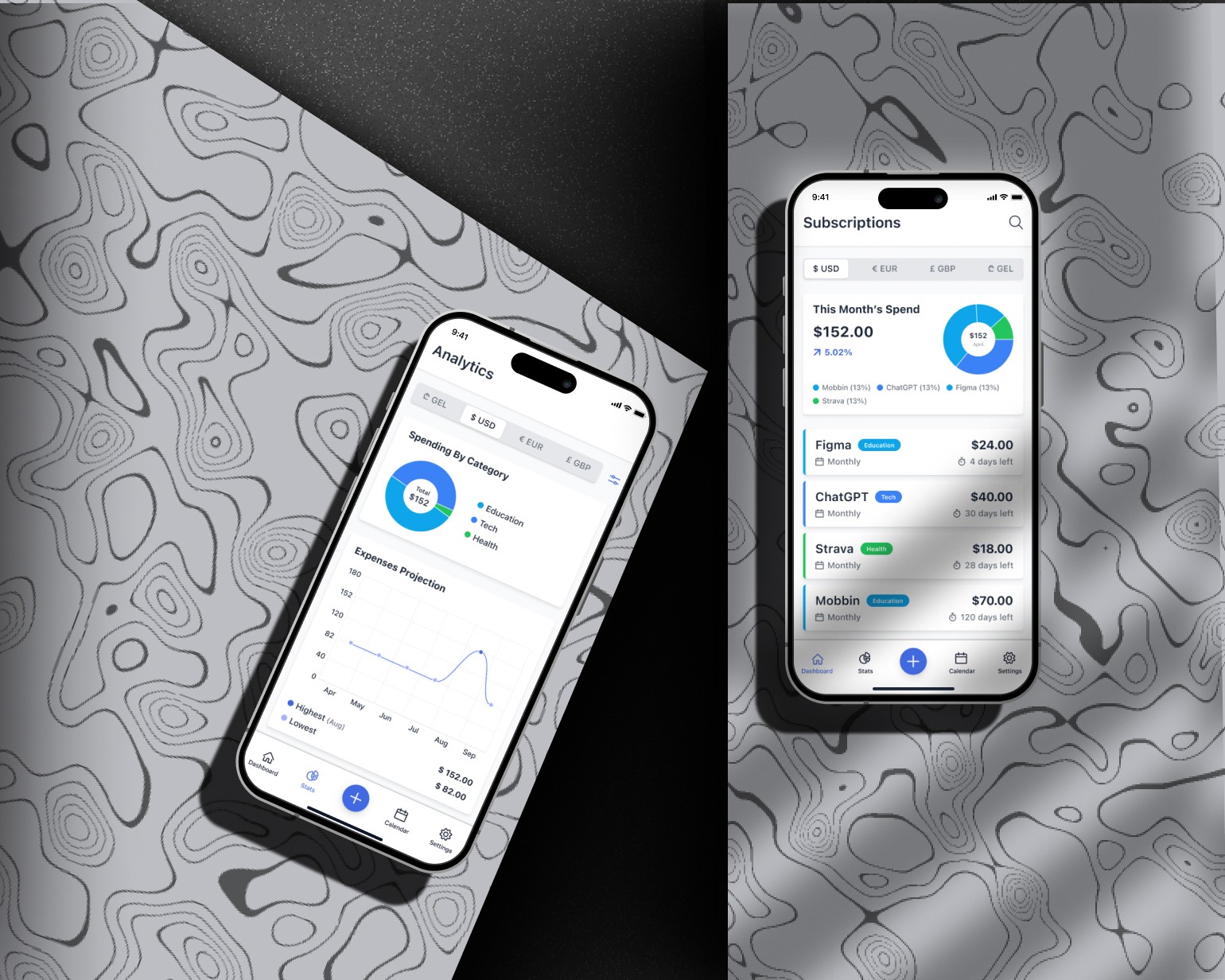
SubSavvy: Subscription Mannager
Designing a mobile app to help users track and manage subscriptions with reminders, spending insights, and full local privacy—from concept to prototype.
Role
UX/UI Desiger
Industry
Money Management Tools
Duration
1 months
Stage 4. User Feedback & Refinement
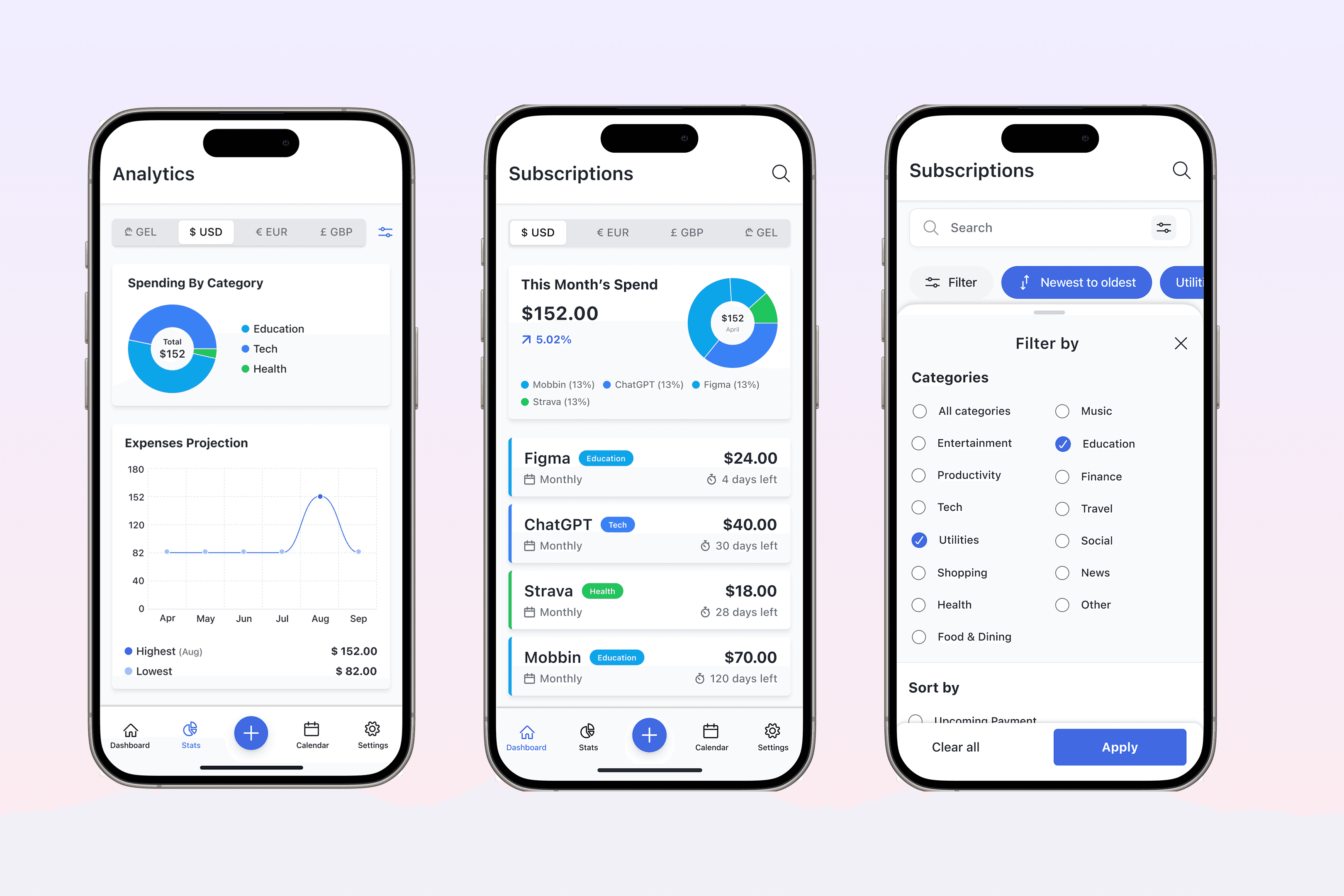
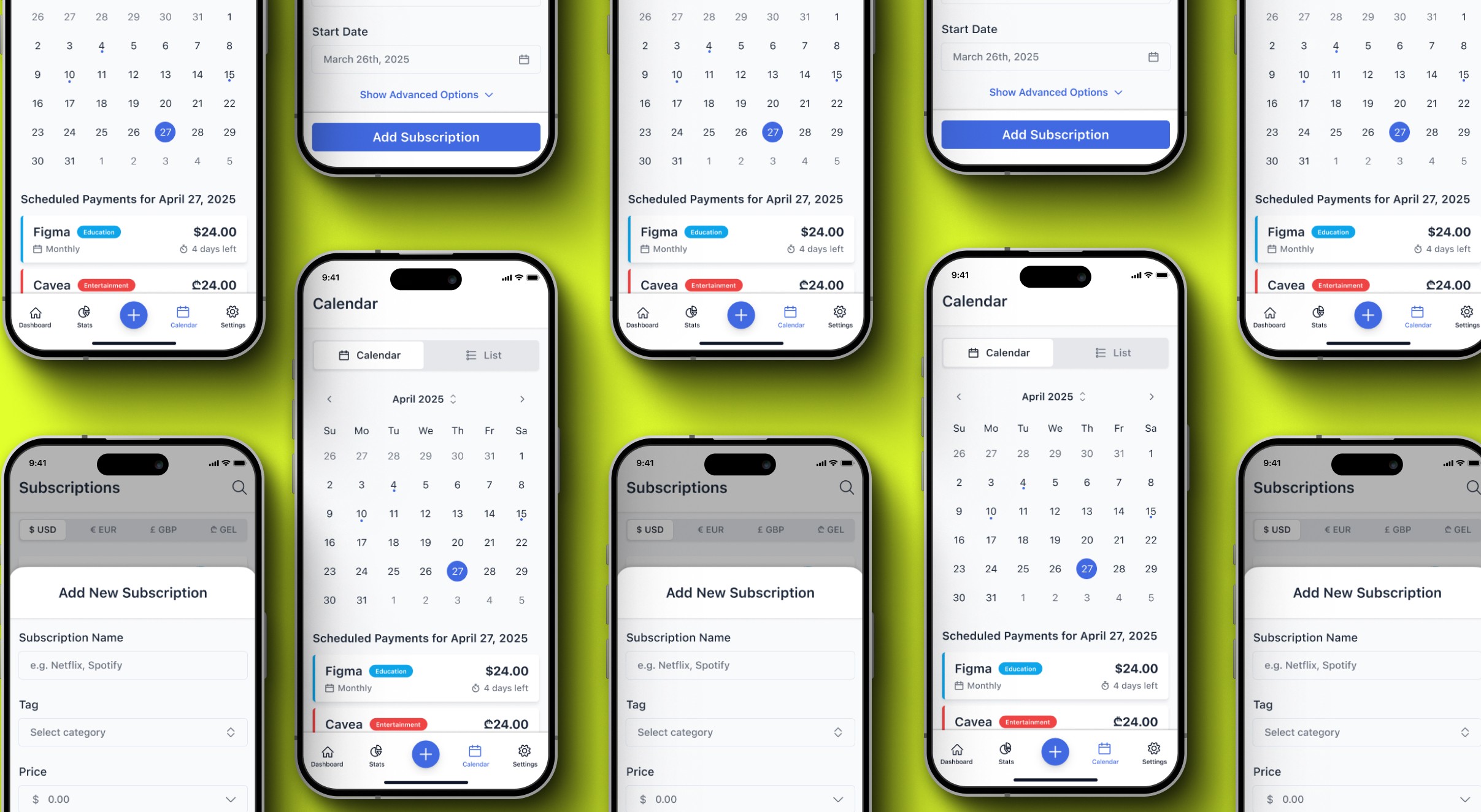
I tested the prototype with a small group of users to evaluate clarity, flow, and ease of use. The feedback confirmed that the layout felt simple and the reminder setup was intuitive. A few areas—like editing or deleting a subscription—needed clearer labels and improved button placement. Based on this input, I refined the UI to make actions more visible and reduce potential confusion
Stage 5. Implementation & Launch Support
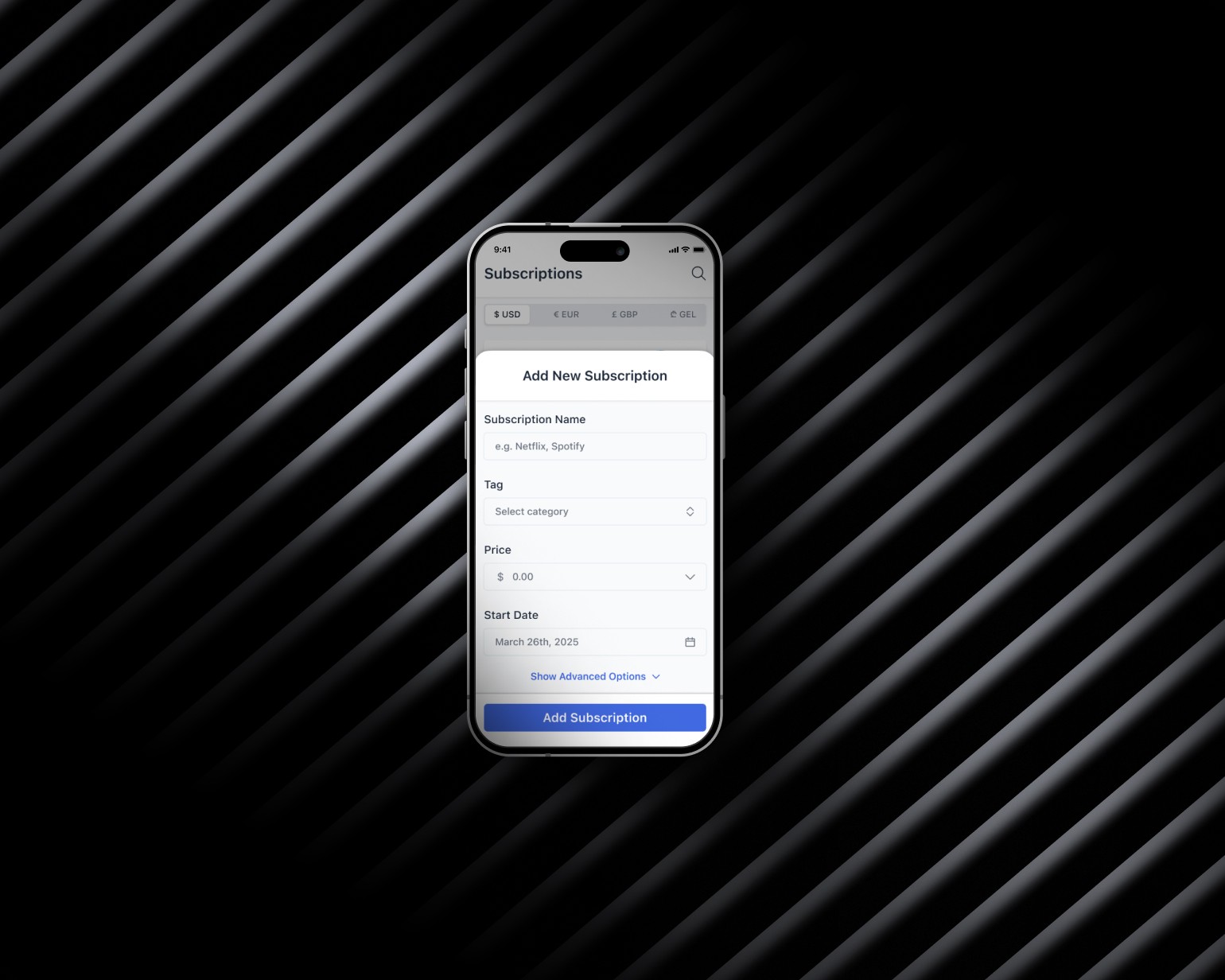
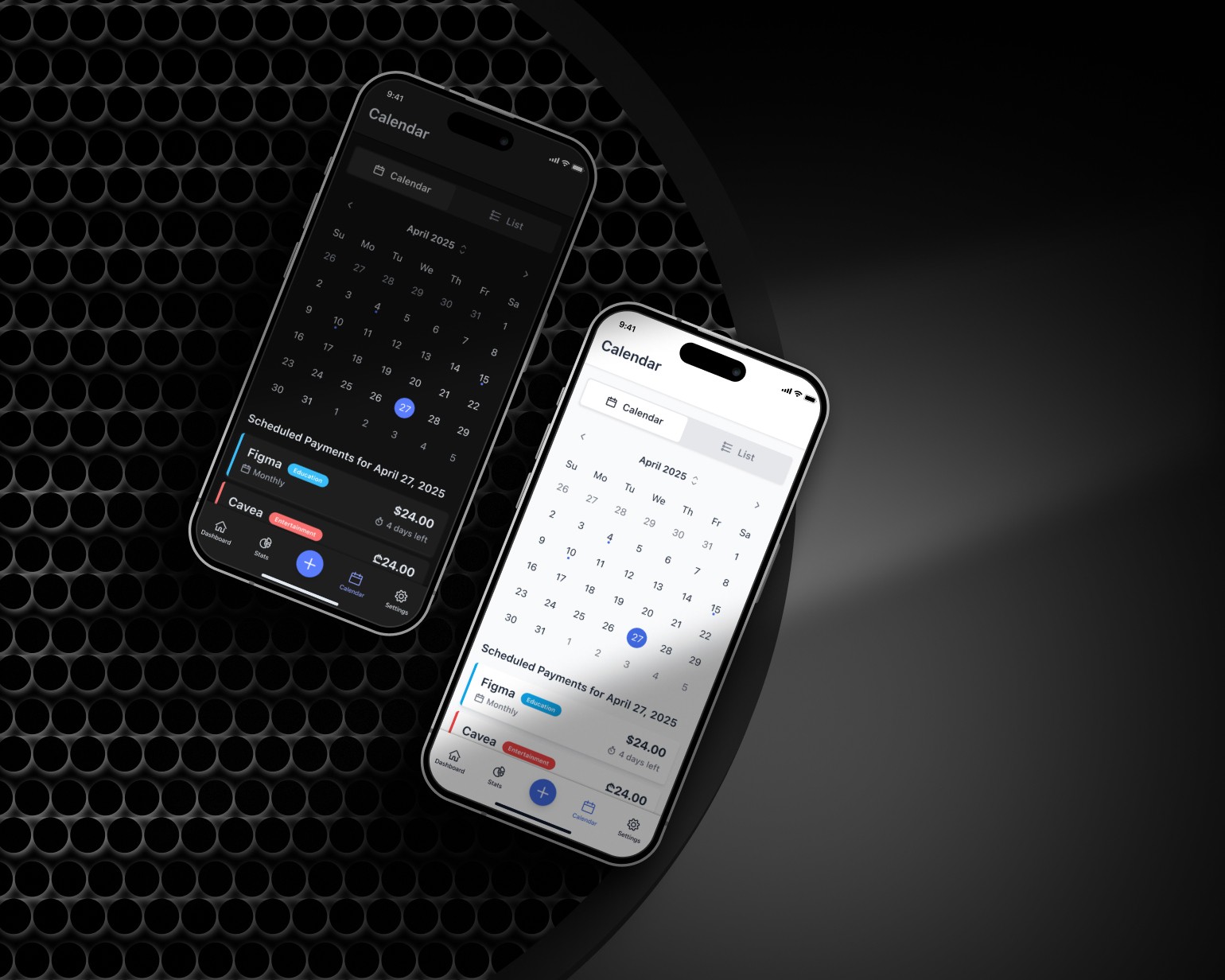
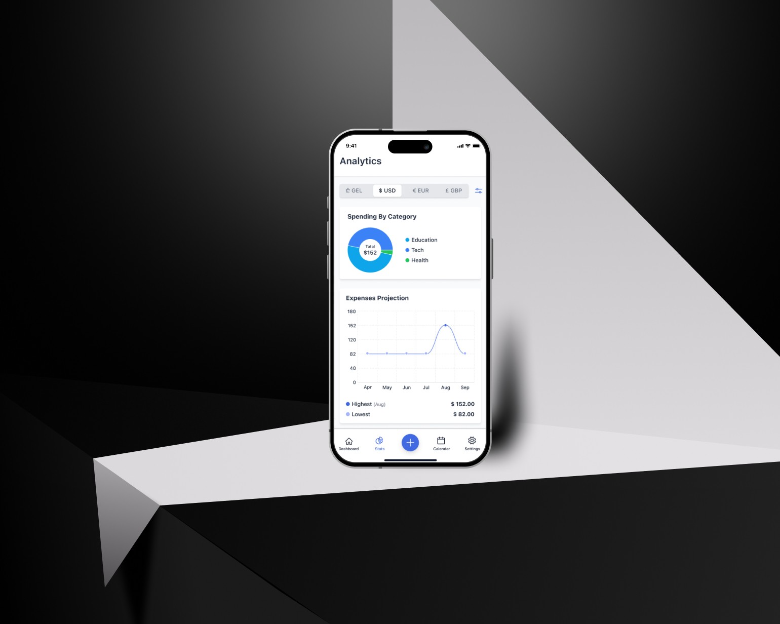
The design work was shared with the developer and is currently being built. I prepared all screens, components, and design specs in Figma to support a smooth handoff. I also included notes for layout, colors, spacing, and interactions to help during development. I stay in touch with the developer to make sure the design is implemented as planned.
Other projects
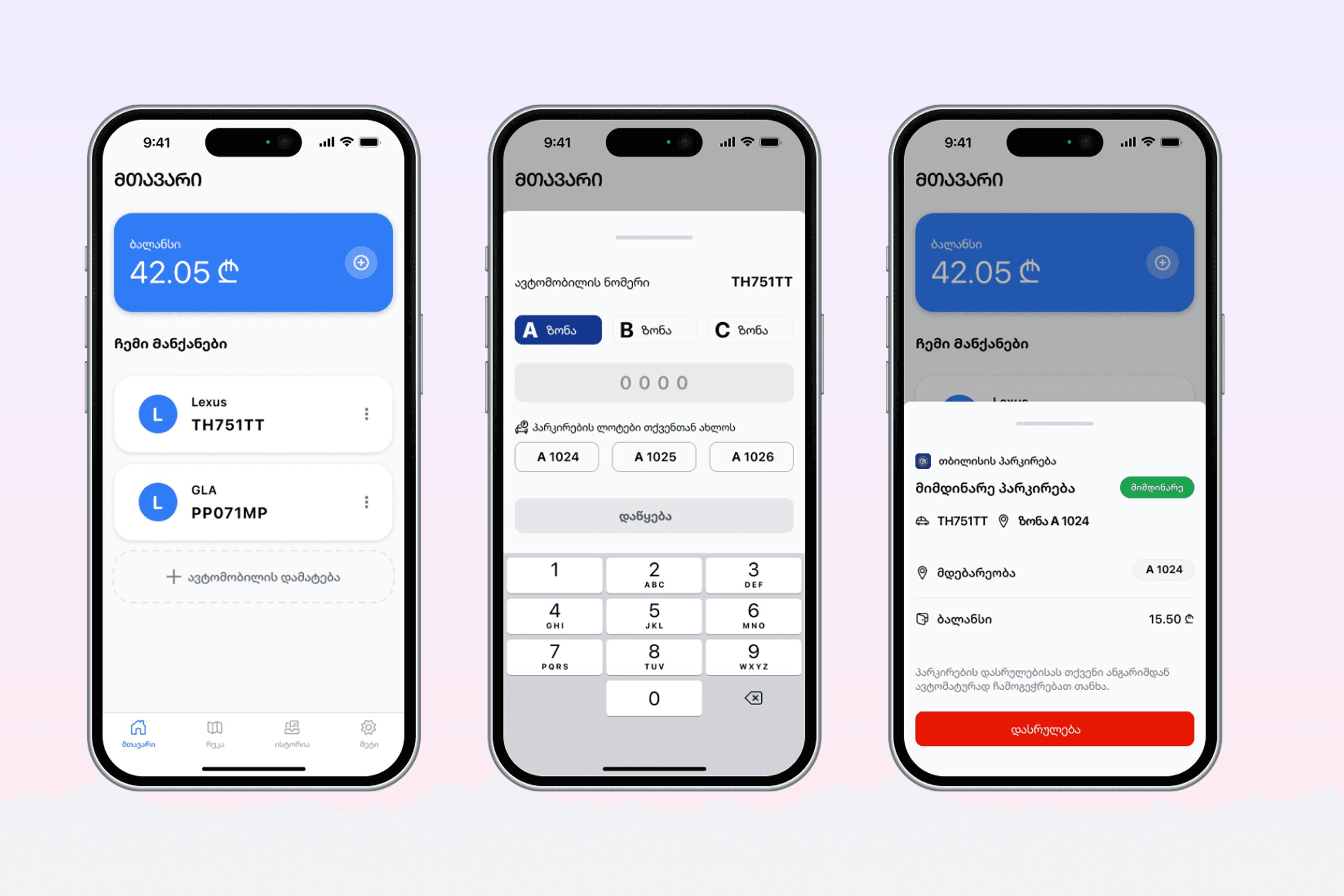
Redesign Project: City Parking App
Redesigning a city parking app to improve usability, accessibility, and real-time awareness.
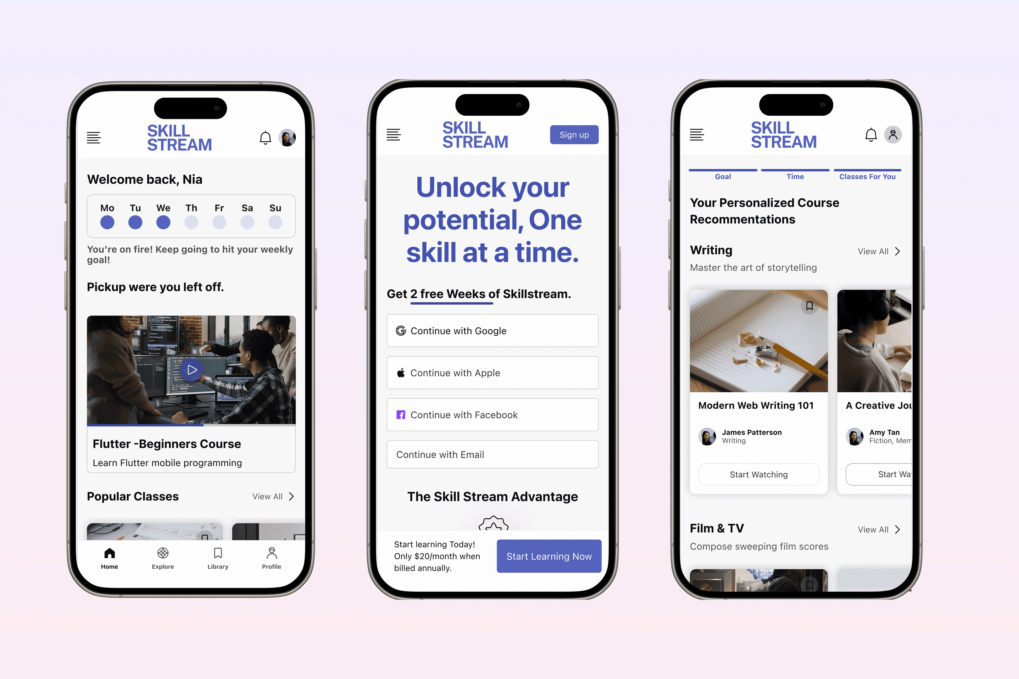
SKILL STREAM - Online learning platform
Building a video-based learning platform designed to make skill-building simple, focused, and accessible—through structured content, smart discovery, and learner-driven progress.