Redesign Project: City Parking App
Redesigning a city parking app to improve usability, accessibility, and real-time awareness.
Role
UX/UI Designer
Industry
Mobility & Parking Services
Duration
1 months
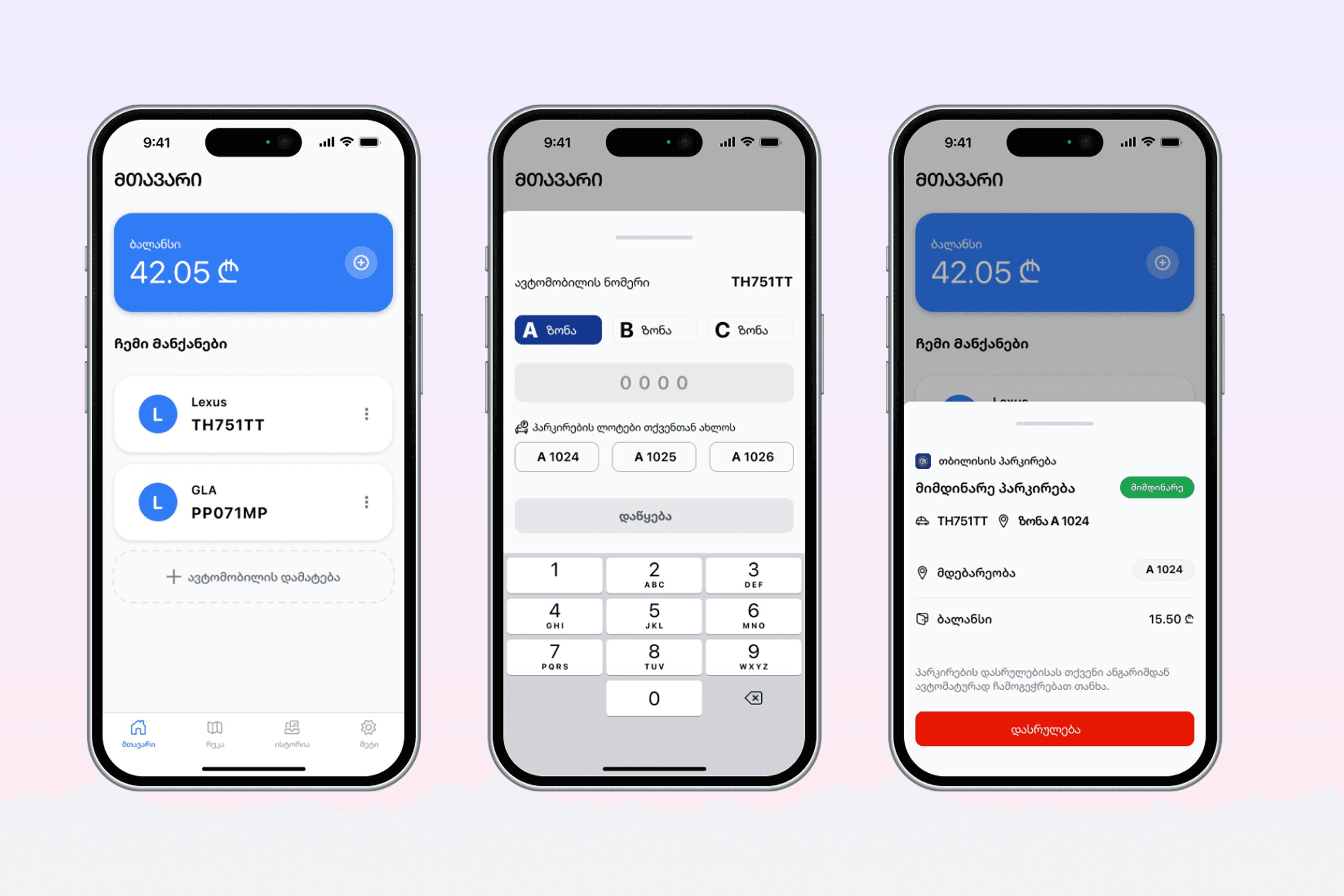
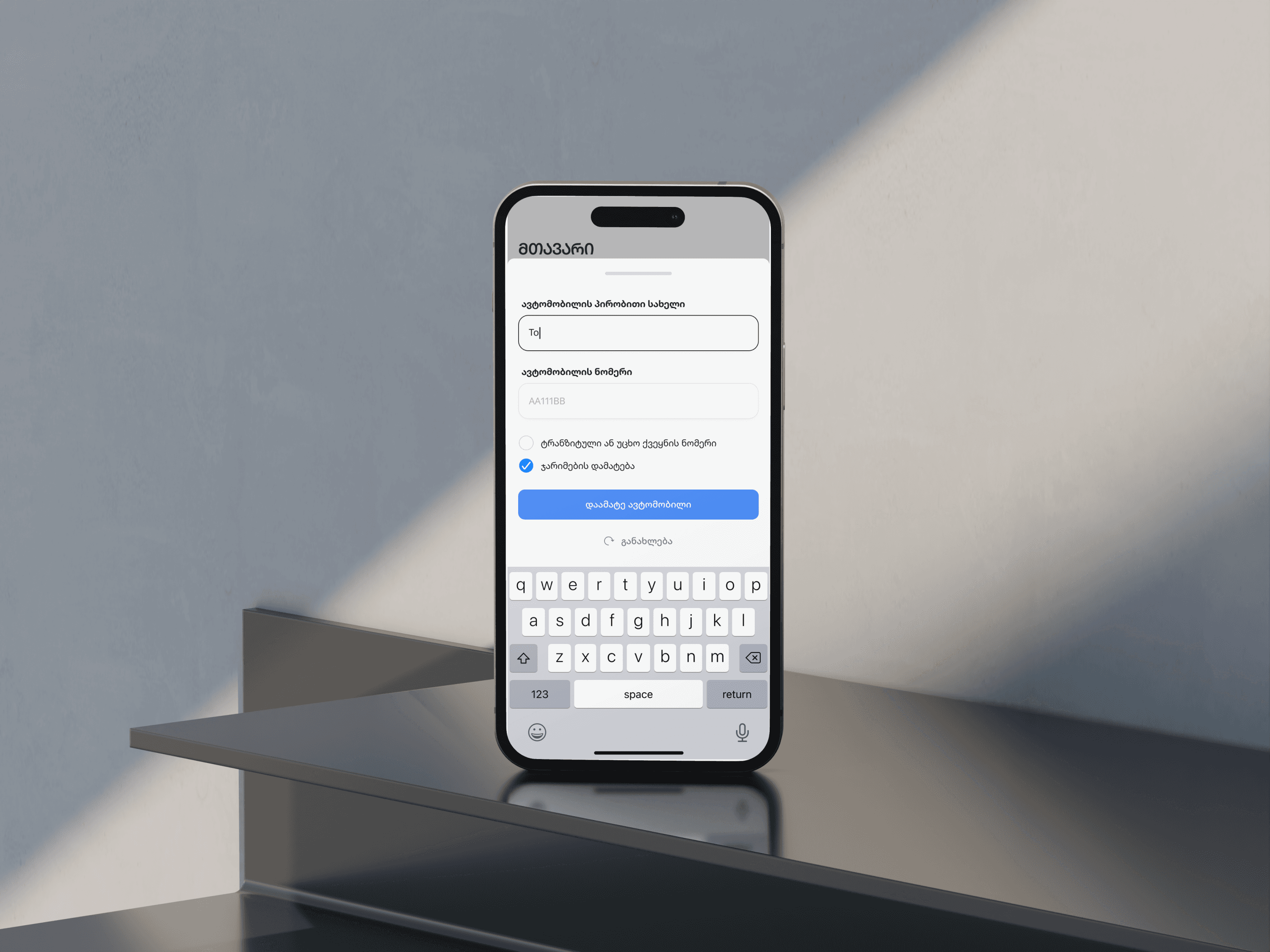
Stage 4. User Feedback & Refinement
I shared the high-fidelity prototype with a small group of users to gather feedback on clarity, ease of use, and overall flow. Users responded well to the cleaner layout and clearer session controls but pointed out areas where labels or button placement could be improved. Based on this input, I adjusted spacing, refined language, and improved visual hierarchy to make key actions more obvious and reduce confusion.
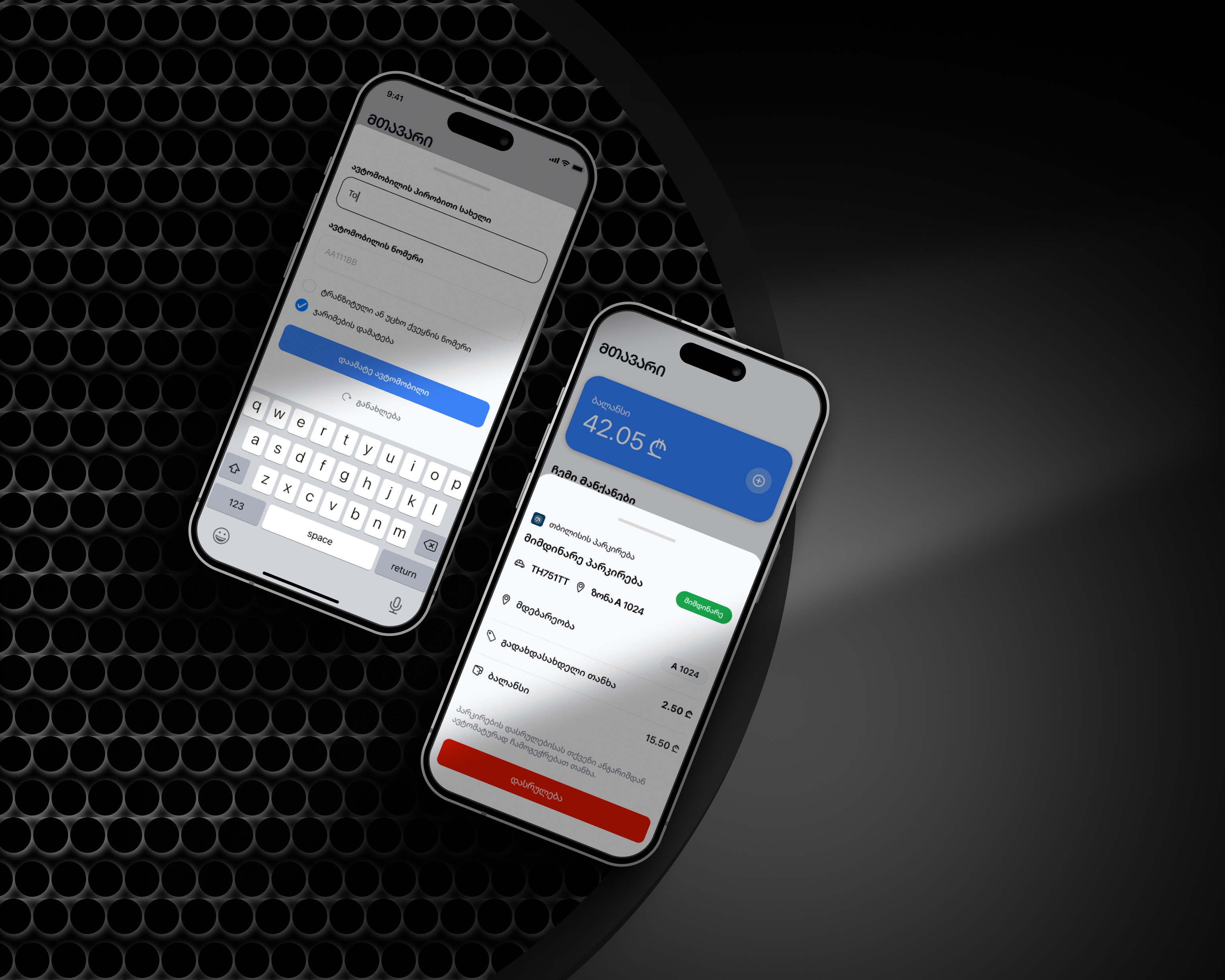
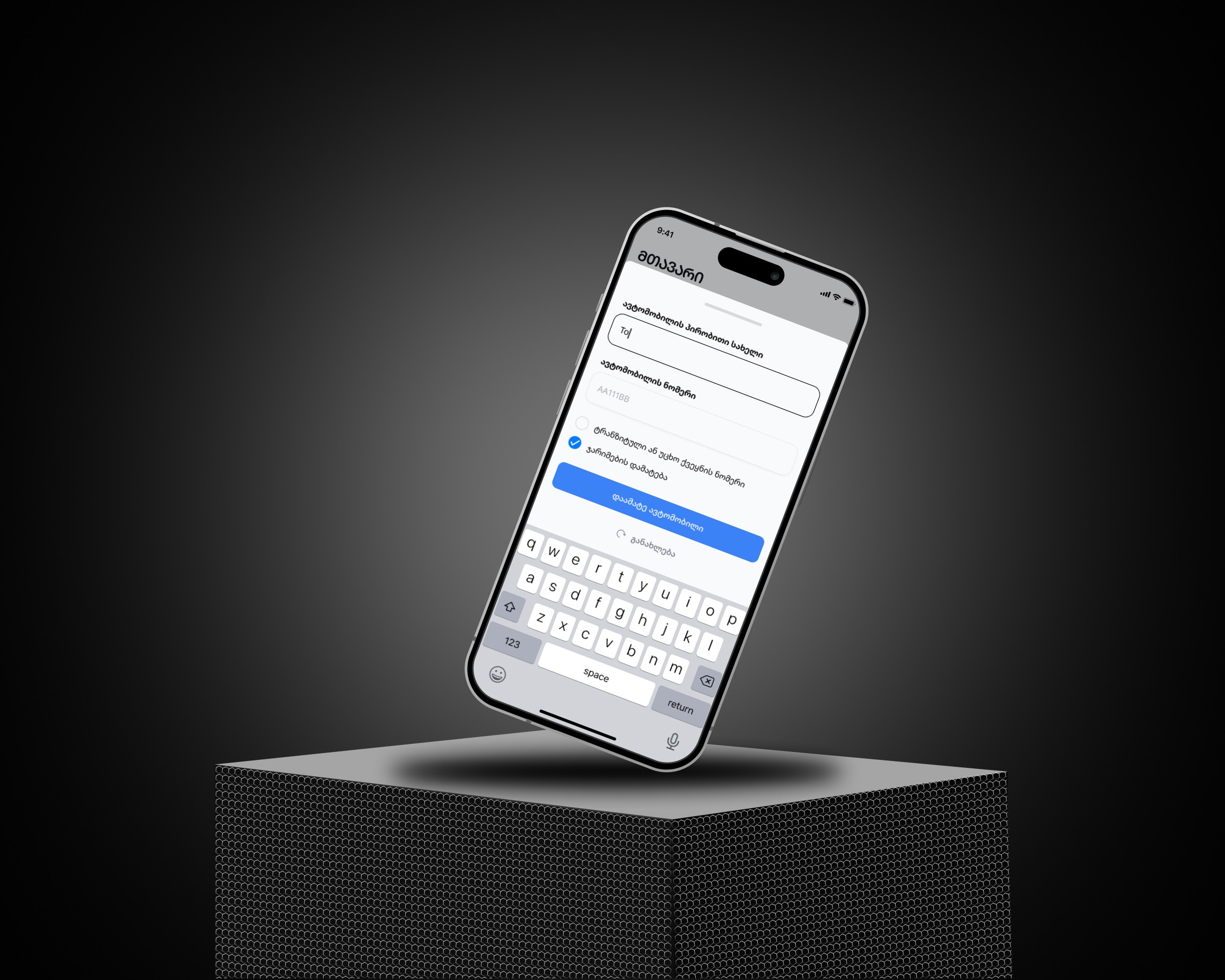
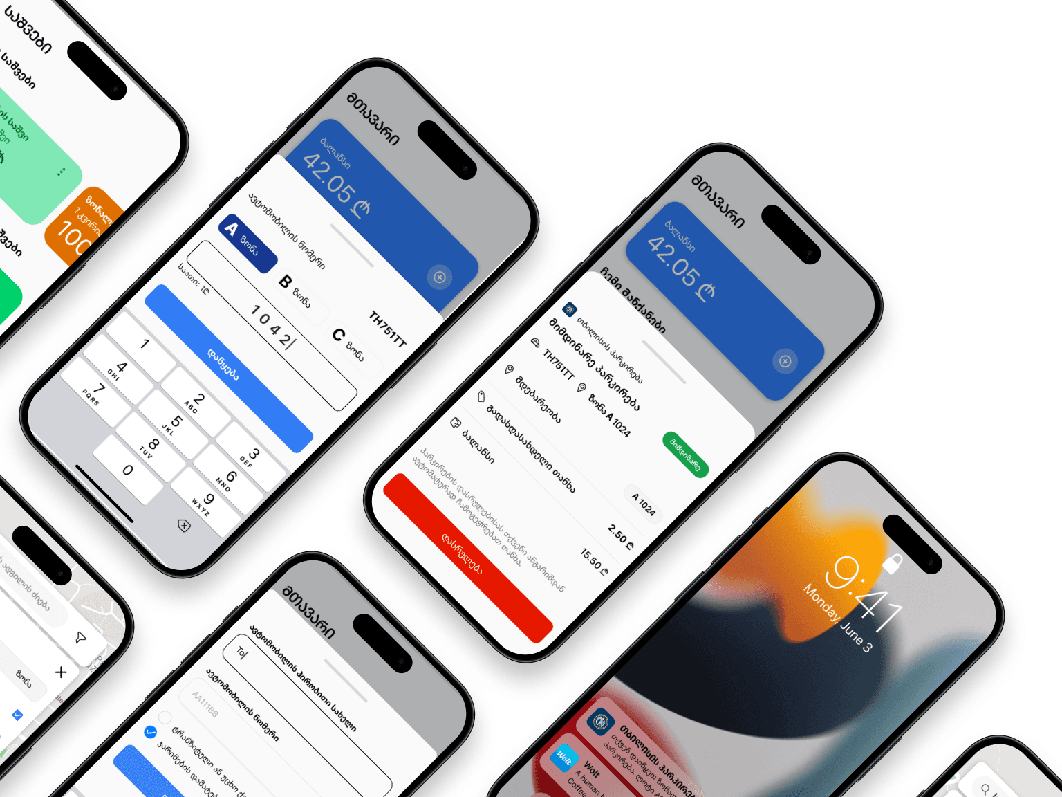
Stage 5. Implementation & Handoff Preparation
Since this project was created for my portfolio, it hasn’t been developed yet. However, the design is fully ready for handoff. I organized components, screens, and flows in Figma and added notes for spacing, states, and interactions. The system supports both light and dark modes, and the prototype covers the full learning experience from onboarding to progress tracking. It’s ready to be shared with developers or tested further.
Other projects
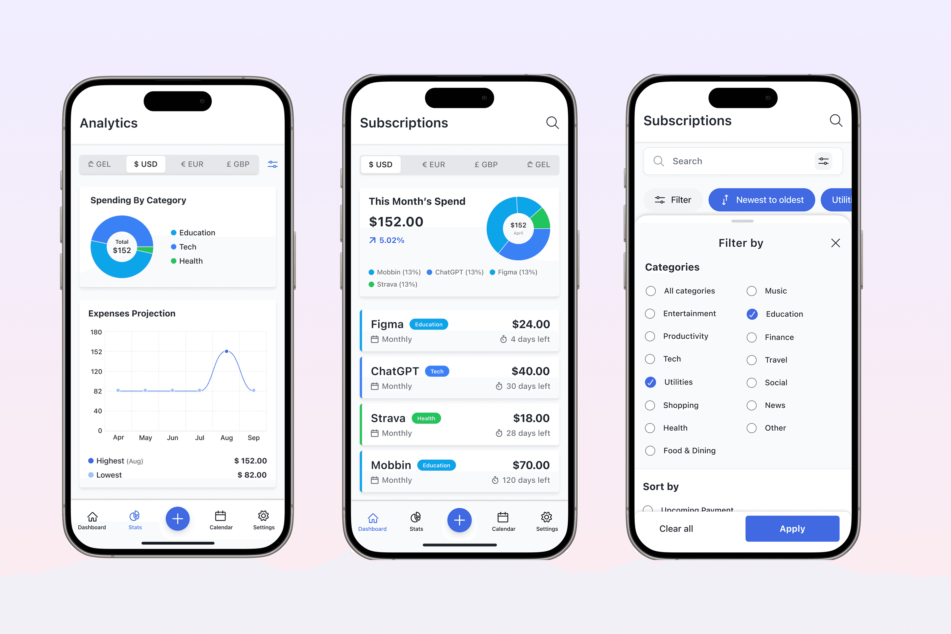
SubSavvy: Subscription Mannager
Designing a mobile app to help users track and manage subscriptions with reminders, spending insights, and full local privacy—from concept to prototype.
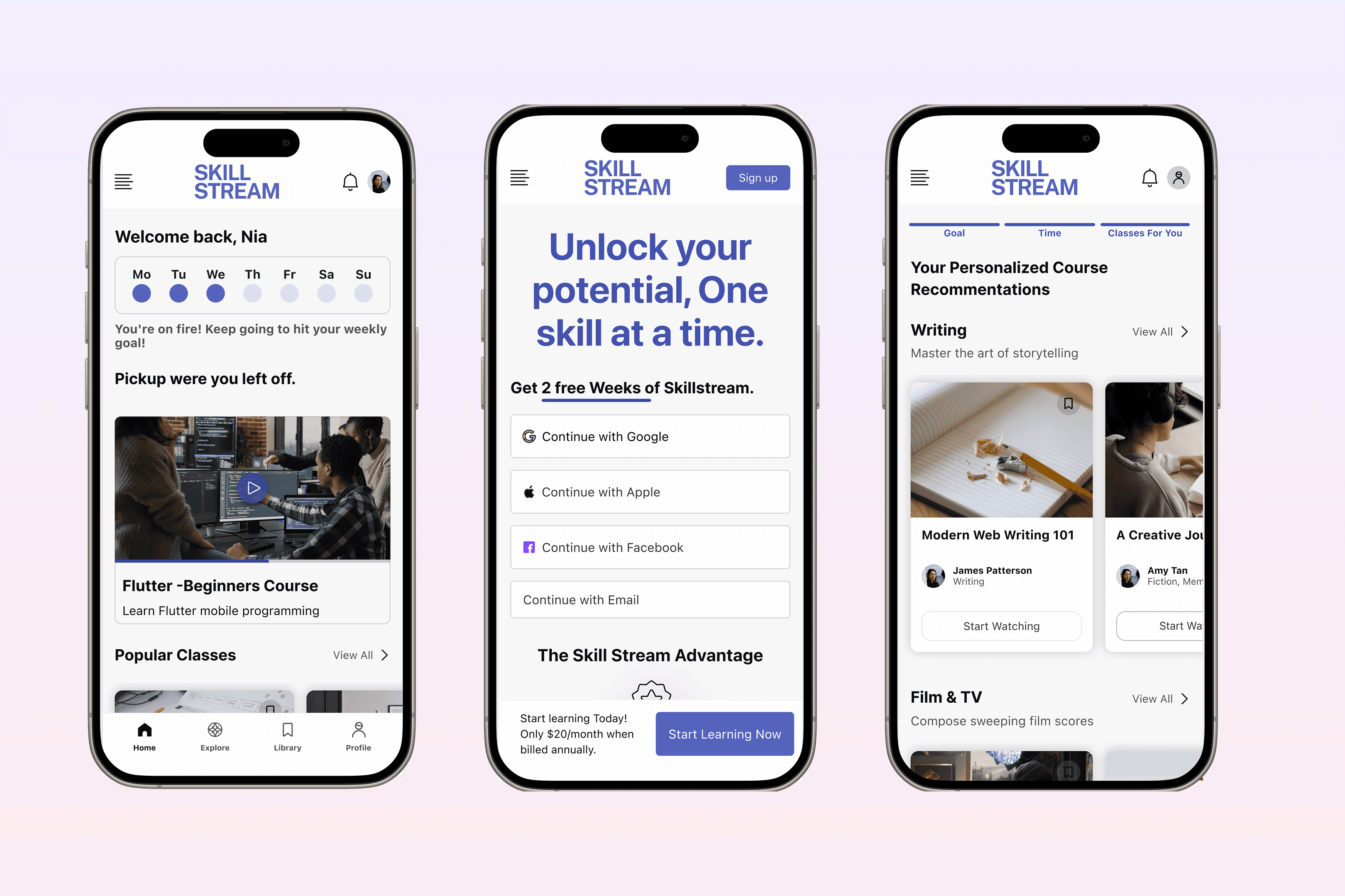
SKILL STREAM - Online learning platform
Building a video-based learning platform designed to make skill-building simple, focused, and accessible—through structured content, smart discovery, and learner-driven progress.