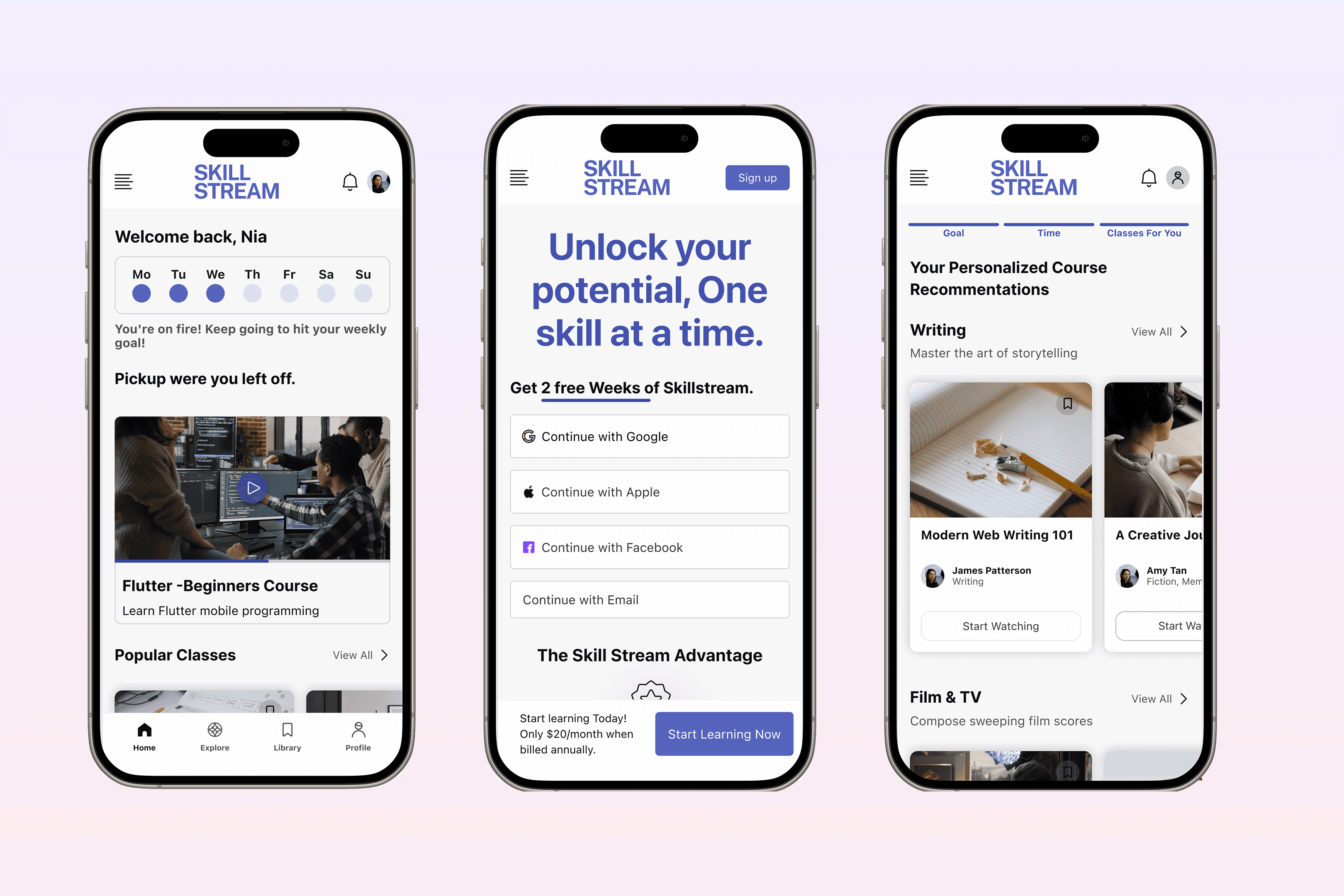
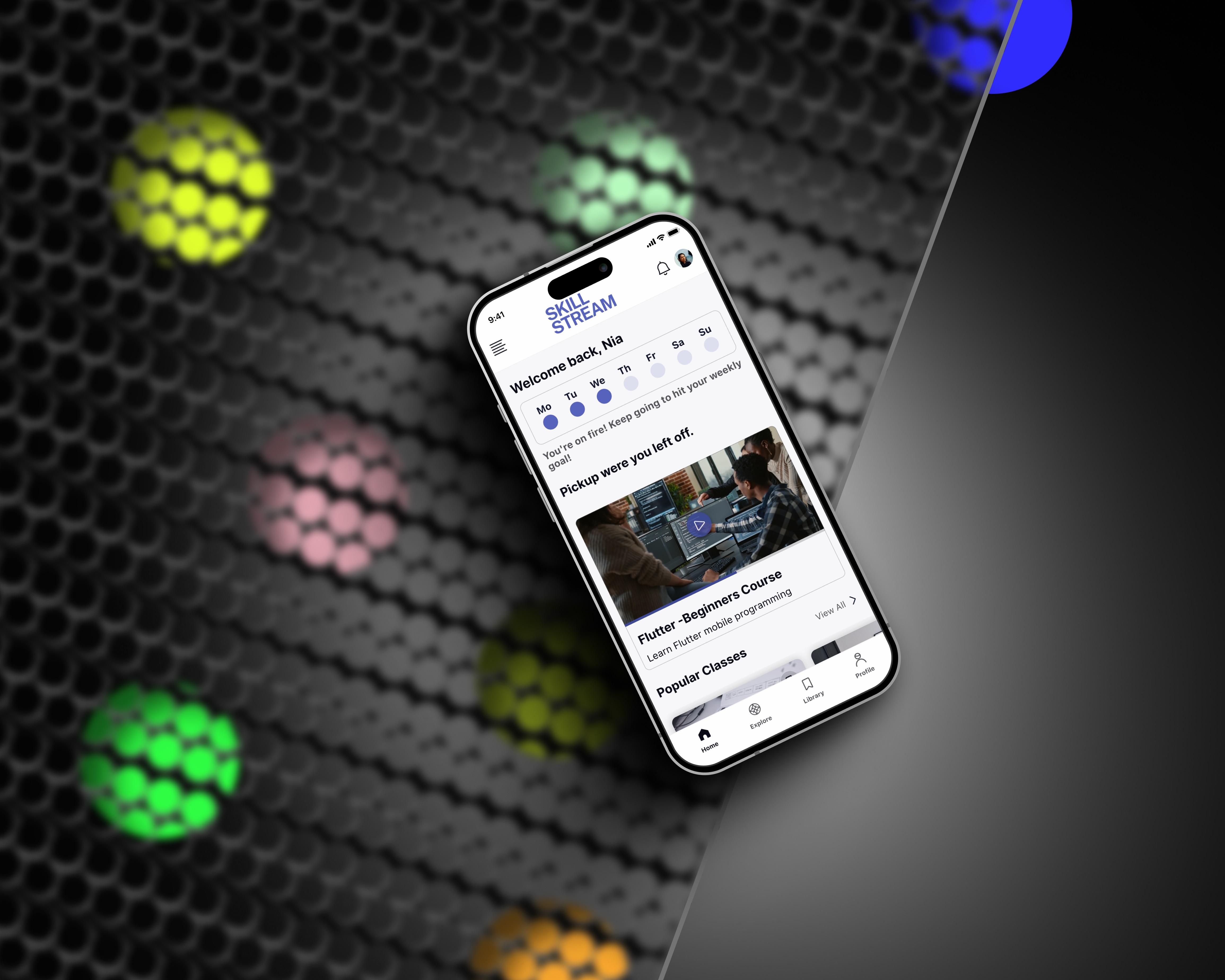
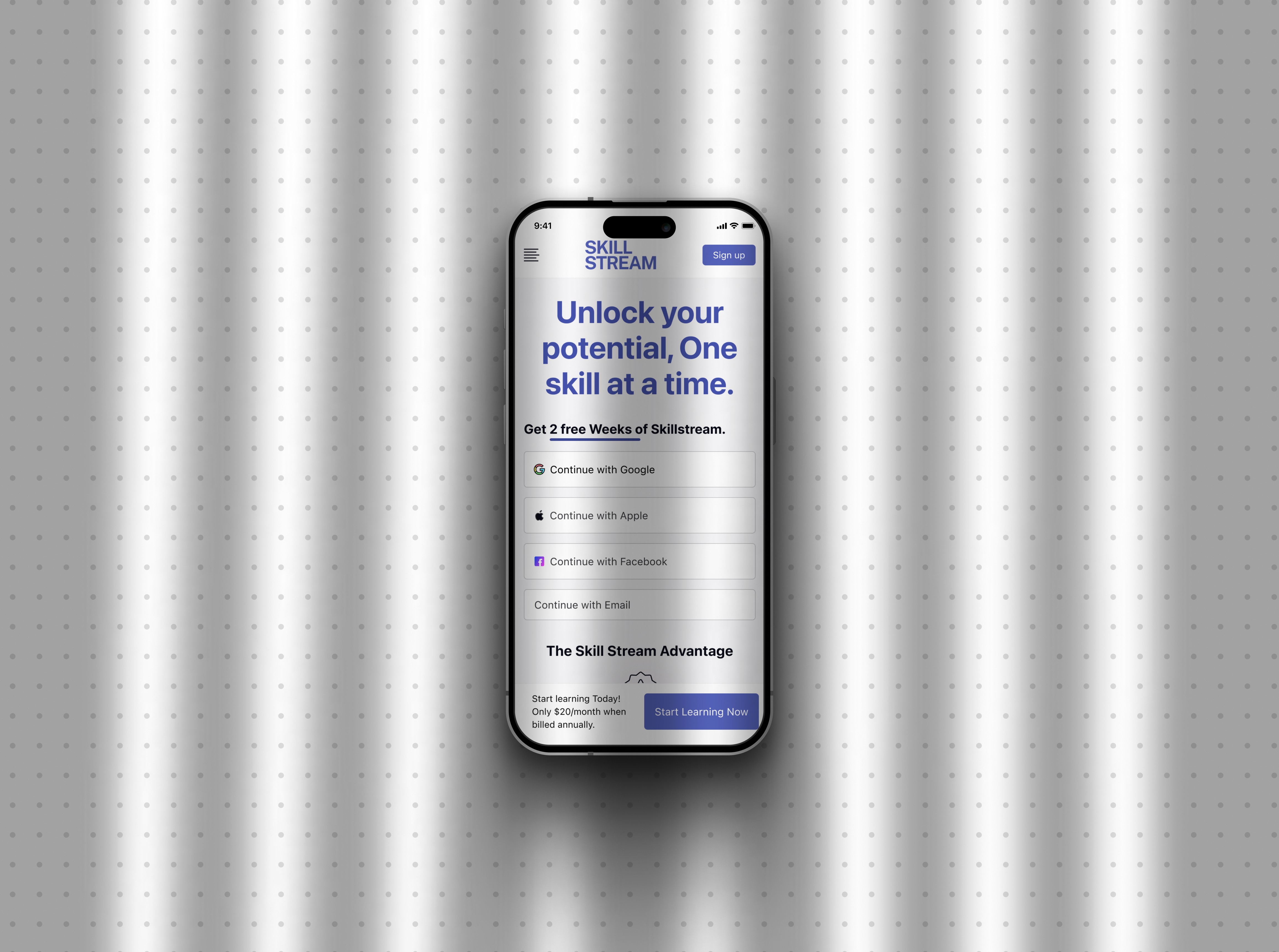
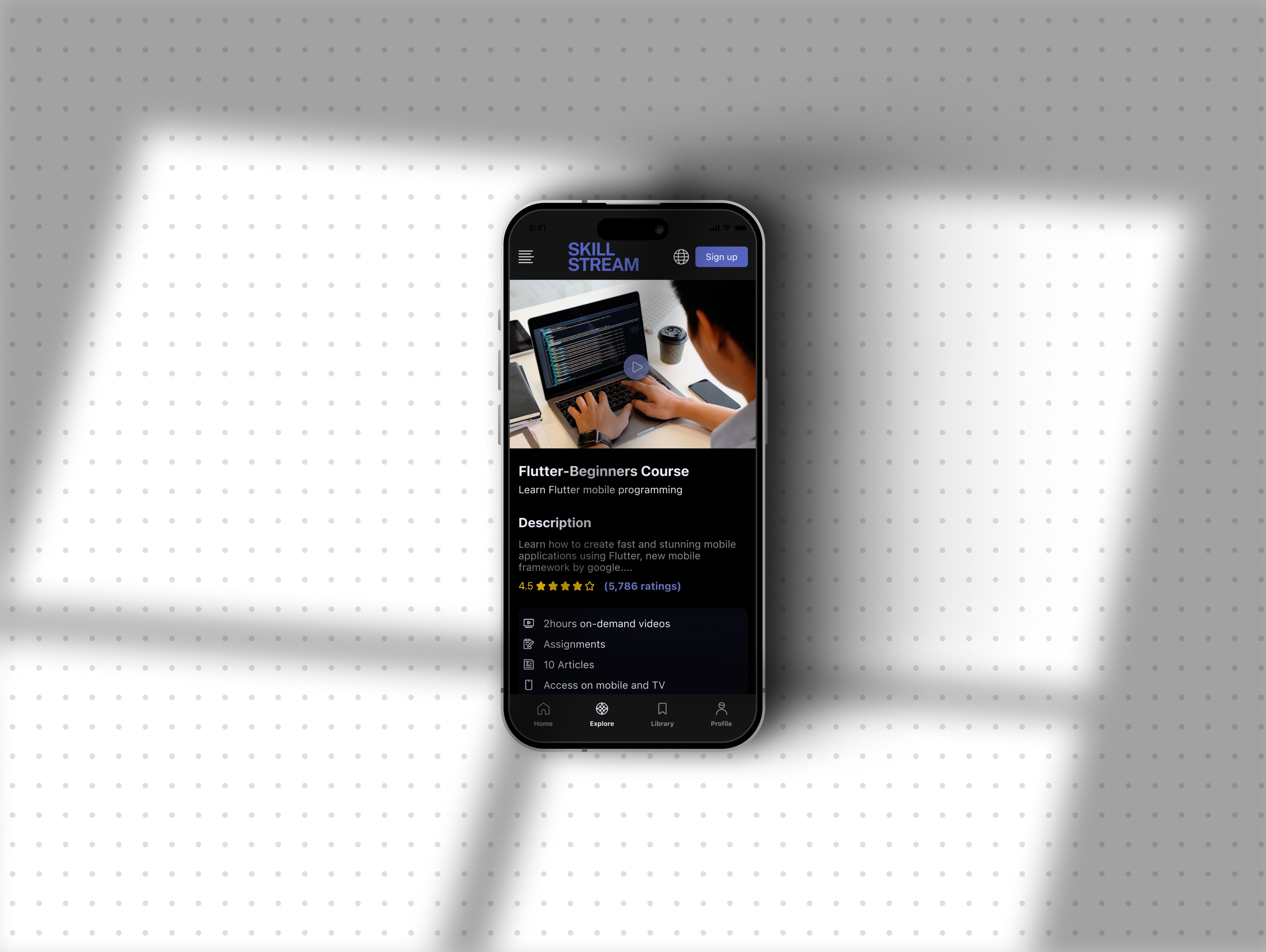
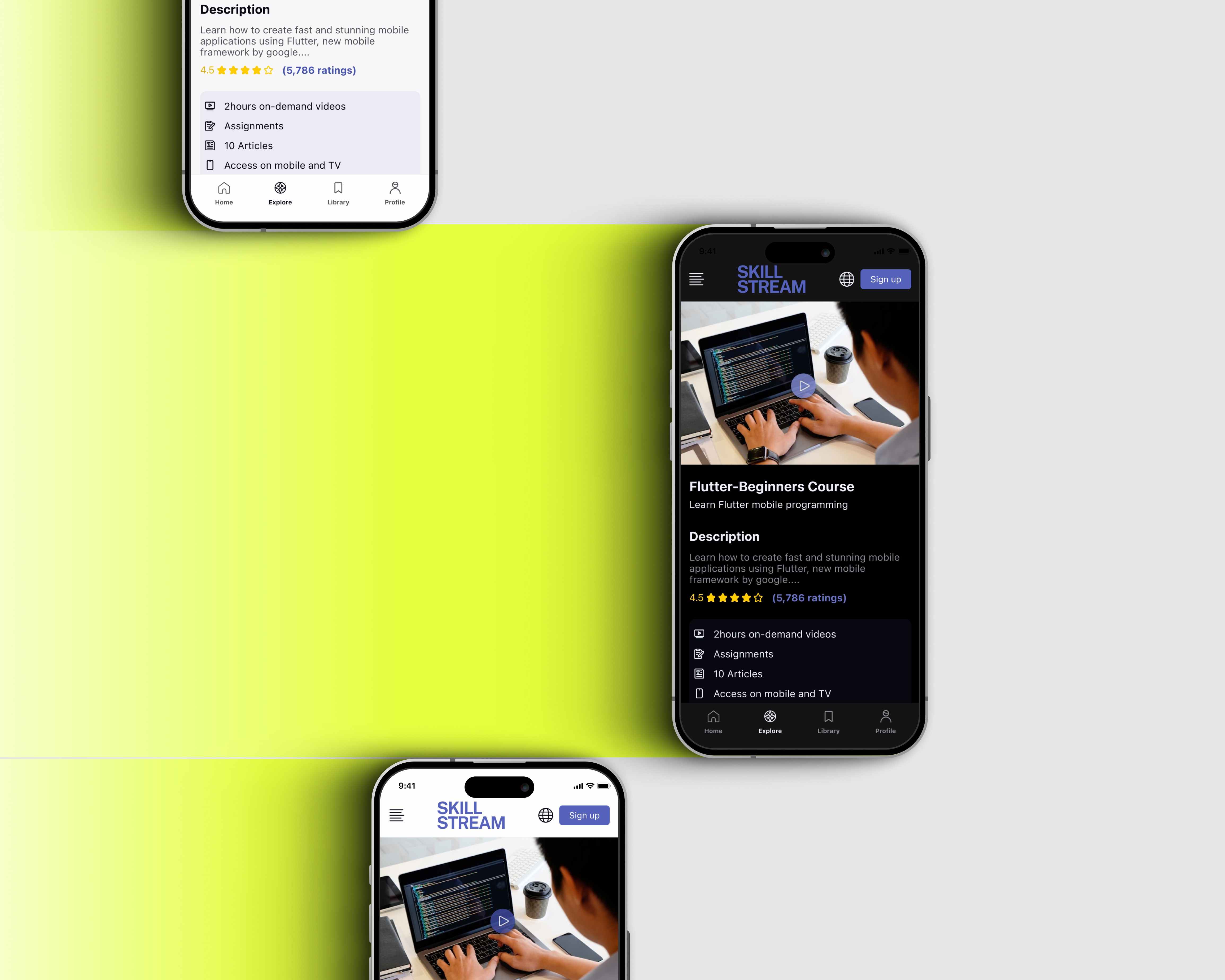
SKILL STREAM - Online learning platform
Building a video-based learning platform designed to make skill-building simple, focused, and accessible—through structured content, smart discovery, and learner-driven progress.
Role
UX/UI Designer
Industry
EdTech
Duration
3 months
Stage 4. User Testing & Iterations
I tested the prototype with a few users to see if the flow was easy to understand. Most found the app simple and liked the short video format, but some had trouble finding saved courses and tracking their progress. Based on feedback, I adjusted the layout, improved button labels, and made the progress section more visible. These small changes helped make the app feel more usable and clear.
Stage 5. Final Presentation and Documentation
Prepared an in-depth presentation and comprehensive documentation detailing the research findings, design rationale, user testing outcomes, and the iterative design process. Highlighted the app's potential to transform the educational landscape by making learning more interactive, engaging, and collaborative.
Other projects
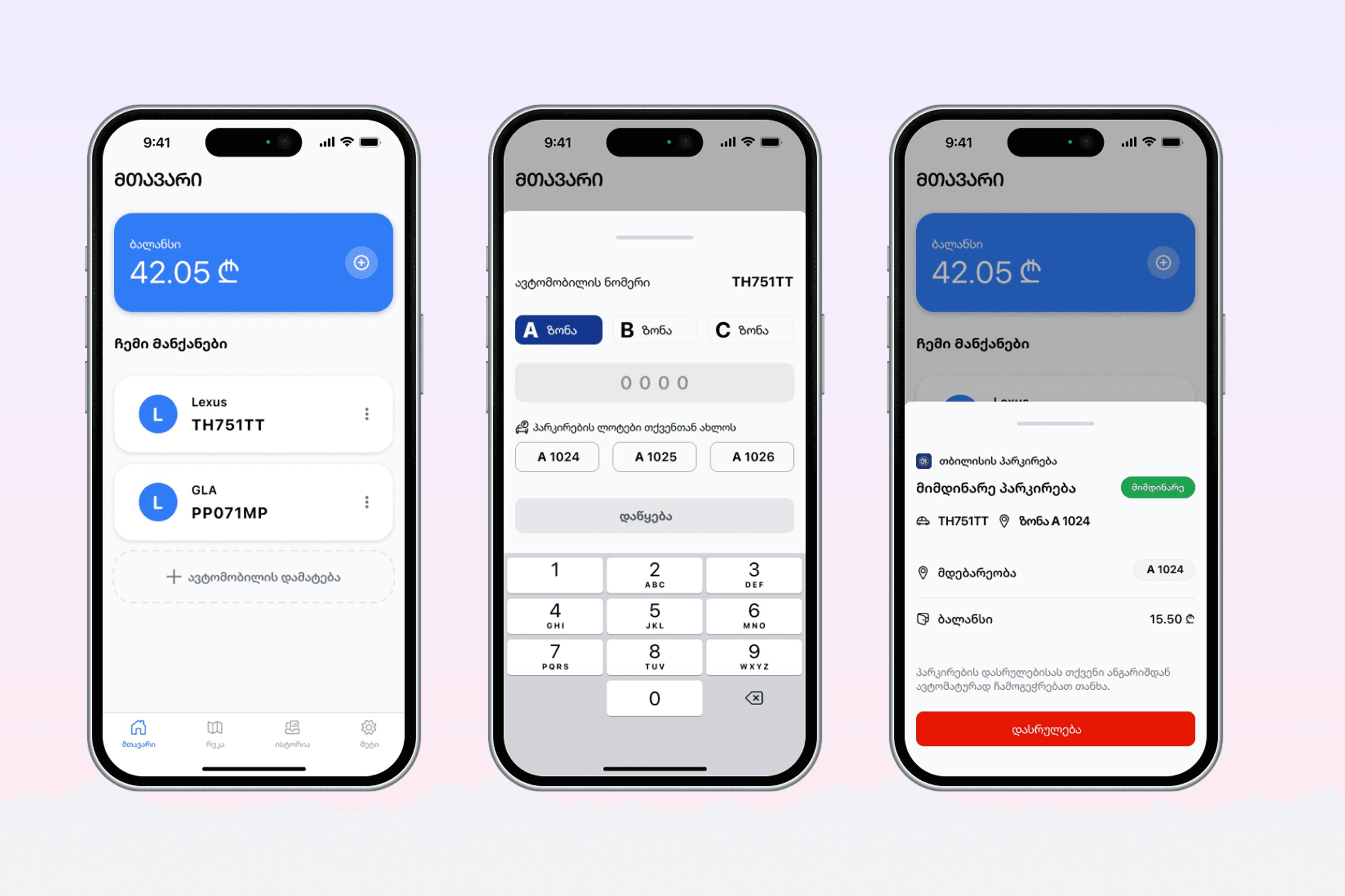
Redesign Project: City Parking App
Redesigning a city parking app to improve usability, accessibility, and real-time awareness.
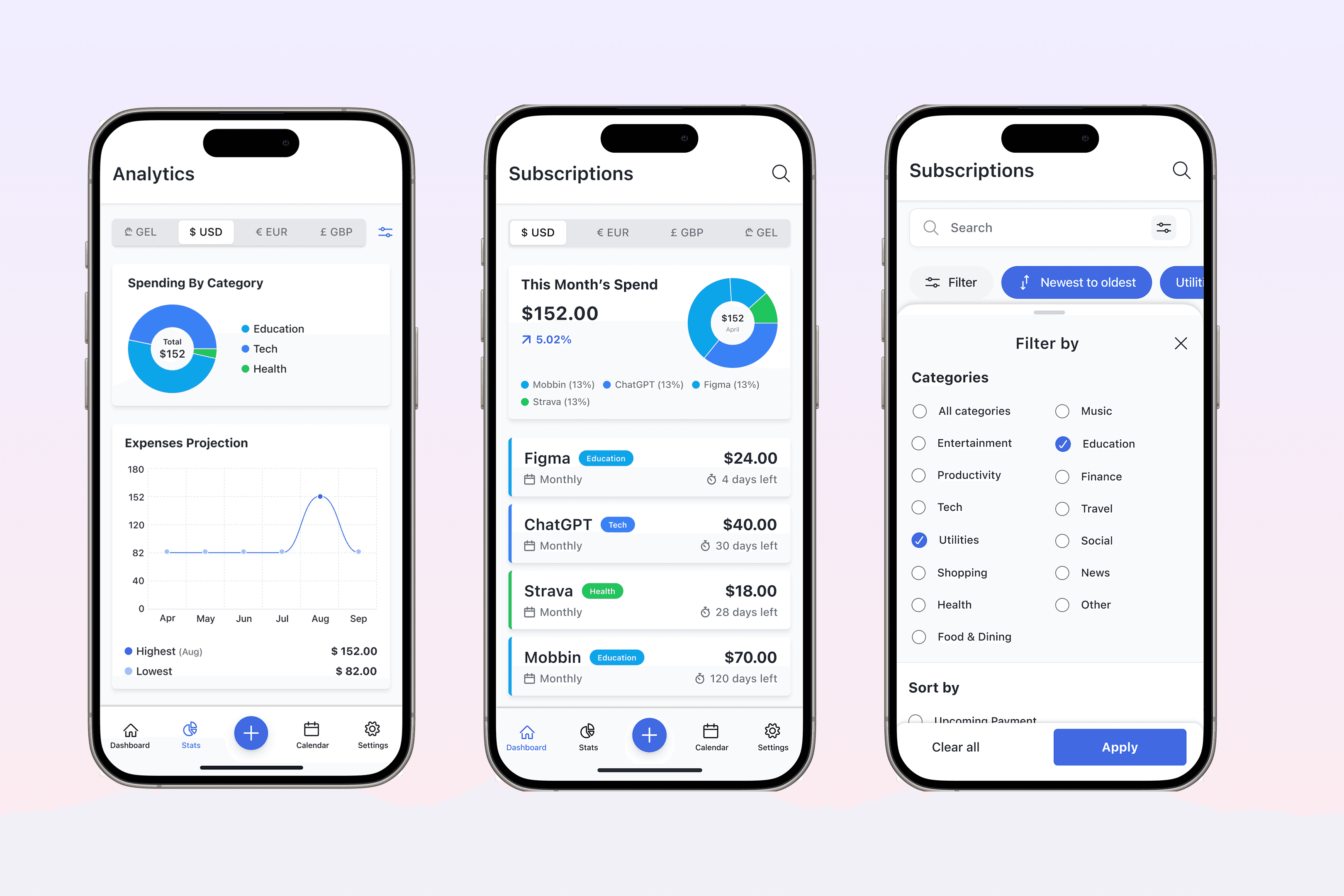
SubSavvy: Subscription Mannager
Designing a mobile app to help users track and manage subscriptions with reminders, spending insights, and full local privacy—from concept to prototype.